Project X
Client: Restaurant Manager at Gauchos
Goal
Create an improved design of the Gauchos restarurant order management system
Research Question
Research Question: How can my interactive UI design improve order management efficiency and user satisfaction in restaurants?
Reason
Working at different restaurants while living here has given me a deeper look into the software most commonly used in this field, often times being unsatisfactory or showcasing areas of improvement, therefore I want to create a universal app which can be personally customized by the stakeholders with quick and efficient UI.
The Process
CMD Methods: Interview,Benchmark Creation,Prototyping, Usability Testing/Stepping stones: Persona, Task Analysis
Methodology
Qualitative(Benchmark Creation):
It aims to enhance comprehension of creating a digital product capable of efficiently managing restaurant orders.Qualitative (Interview):
Based on research and insights from users, I created a segment of the user population and defined a persona as a representation. Used insights from observations and interviews to depict a persona based on their needs, goals, habits, social background, and pain points regarding the app’s current usability.Qualitative (Usability testing):
This method was used to gather the amount of problems and technical difficulties the user is facing when navigating.Qualitative (Task Analysis):
This method was used to gather the amount of problems and technical difficulties the user is facing when navigating.Empathize
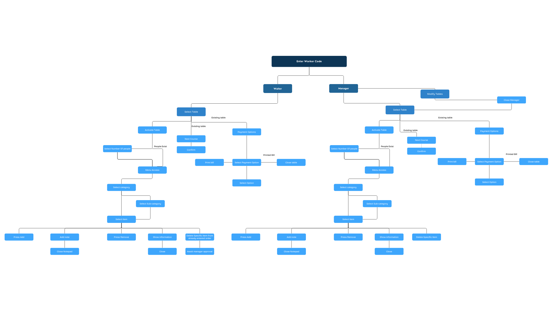
I created a flowchart as the task analysis for better understanding the vital tasks that need to be made functional for the prototype to work, as well as gaining insight on the number of tasks that need to be created.
Define
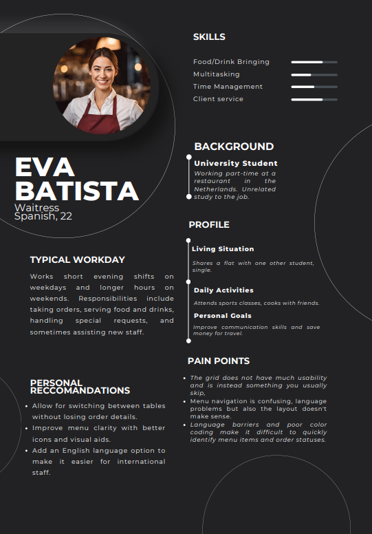
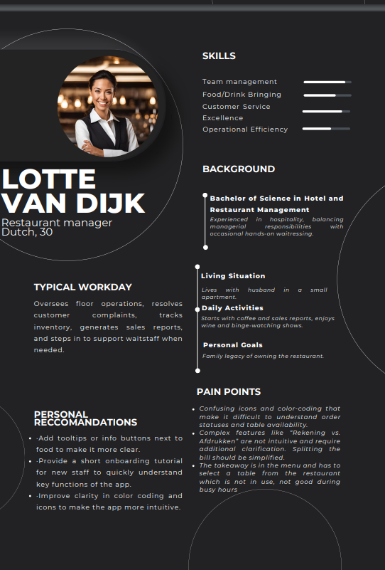
In the define stage I went to to create two personas based on the interview questions, as well as do a data analysis of the problem-based interview.
A user persona is a fictional character crafted to embody the characteristics and behaviors of the target users of a product. These personas serve as a tool to concentrate on recognizing and addressing the problems encountered by users, fostering a more user-centric approach in product development.
I also went on to create a task analysis flowchart to help me get a better grasp of the app’s functionality which should be integrated in the prototype.
Pain points:
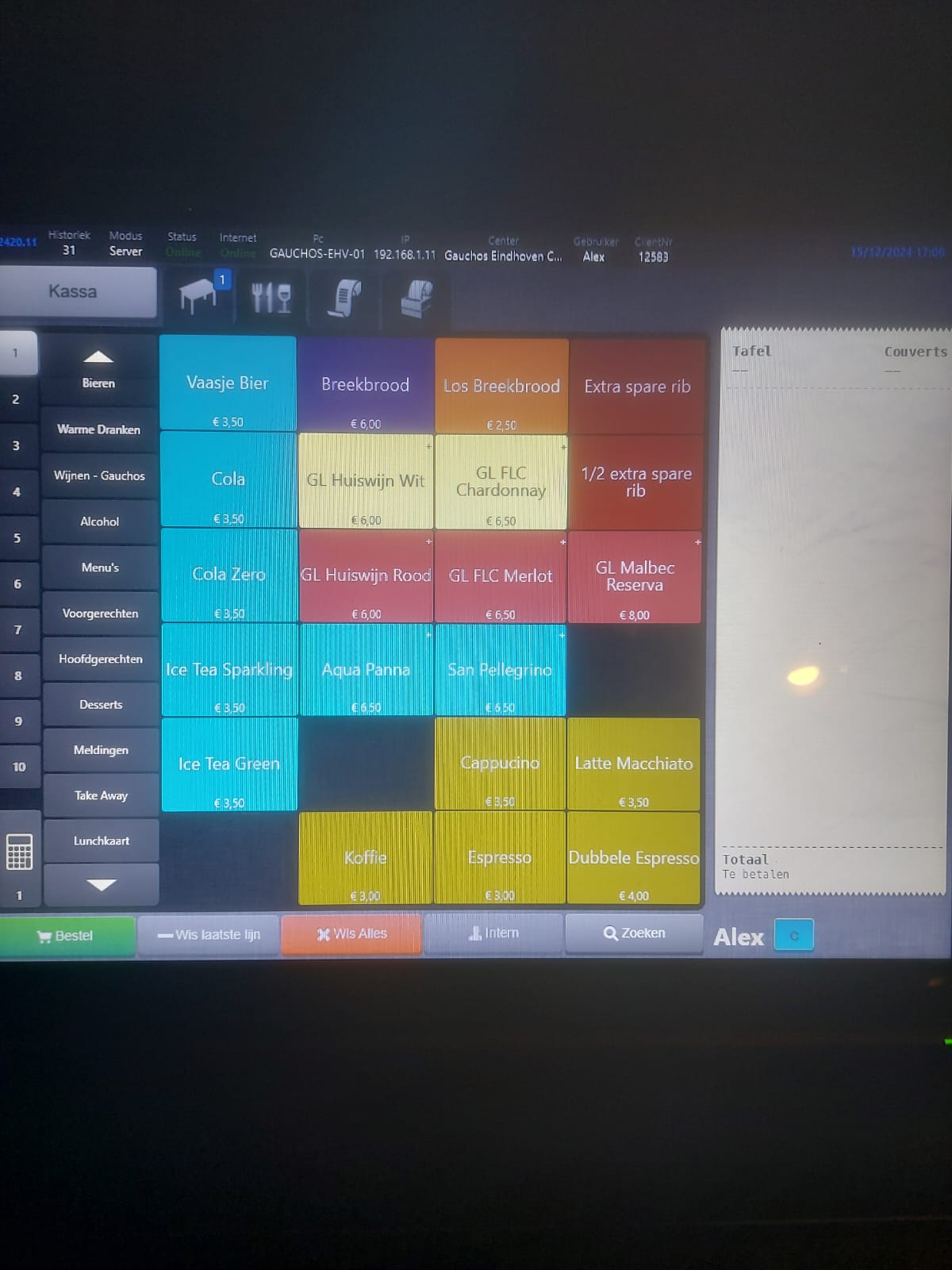
Confusing icons and color-coding that make it difficult to understand order statuses and table availability.
Complex features like “Rekening vs. Afdrukken” are not intuitive and require additional clarification. Splitting the bill should be simplified.
The takeaway is in the menu and has to select a table from the restaurant which is not in use, not good during busy hours
Therefore, the main issues are the color coding, the food not having enough information, language barriers and messages such as what course is a certain table at, as well as easy to understand features.
Ideation
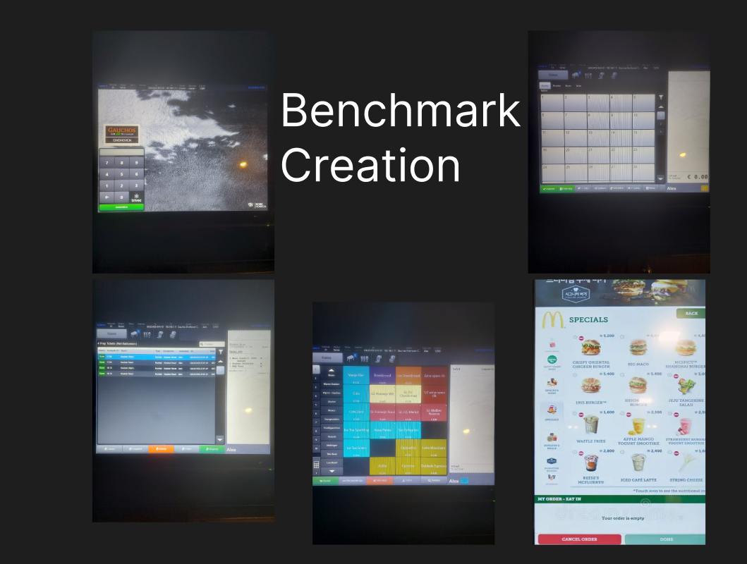
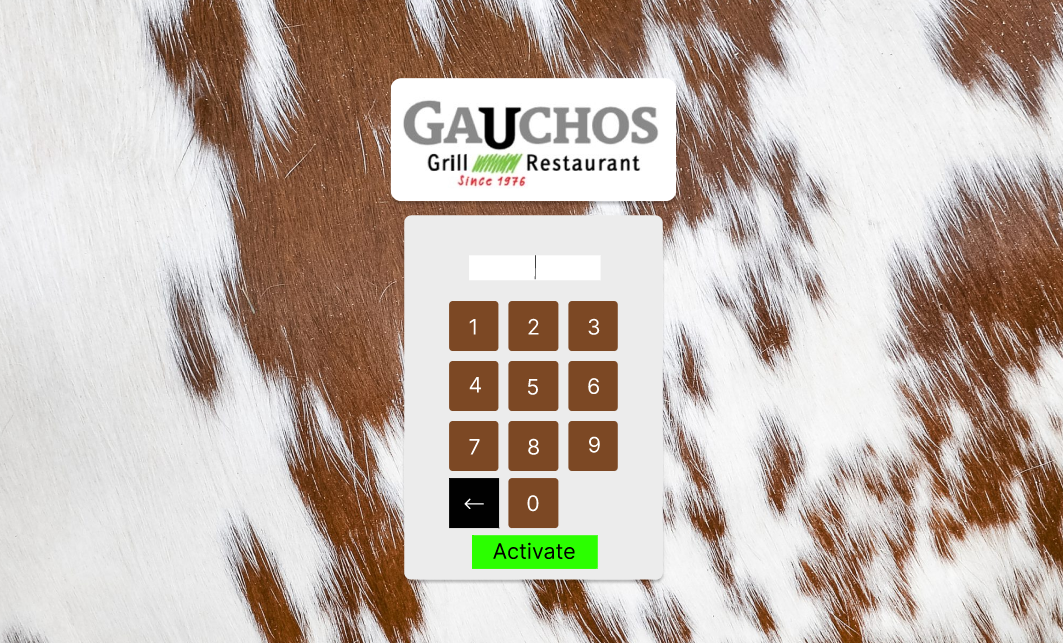
I went on to create a wireframe to help me layout the base of the prototype, staying as true as possible to the references used in the benchmark creation. Such as the app we are using right now, since most problems are cosmetic and the restaurant doesn’t need an app redo right now. I also followed the fast food restaurant’s self-order kiok’s since they are used frequently worldwide and are easy to understand by many users.
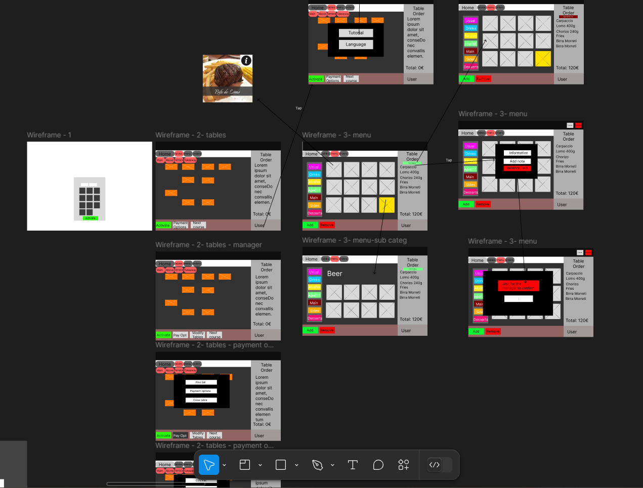
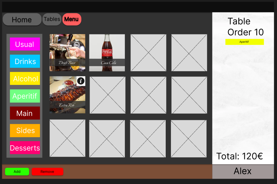
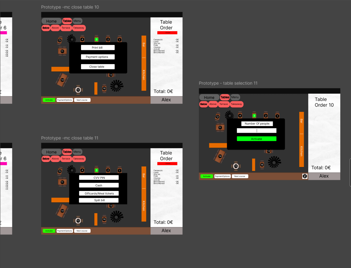
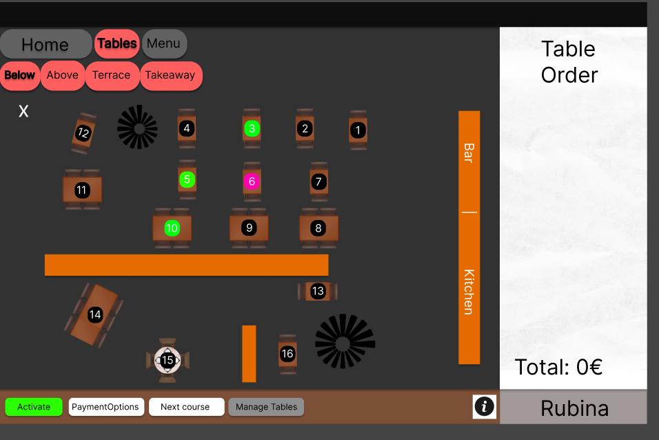
After completing the wireframe, I moved on to the next step, where I created a high-fidelity design. The following is the outcome of the UI design that I’ve developed.
Prototype
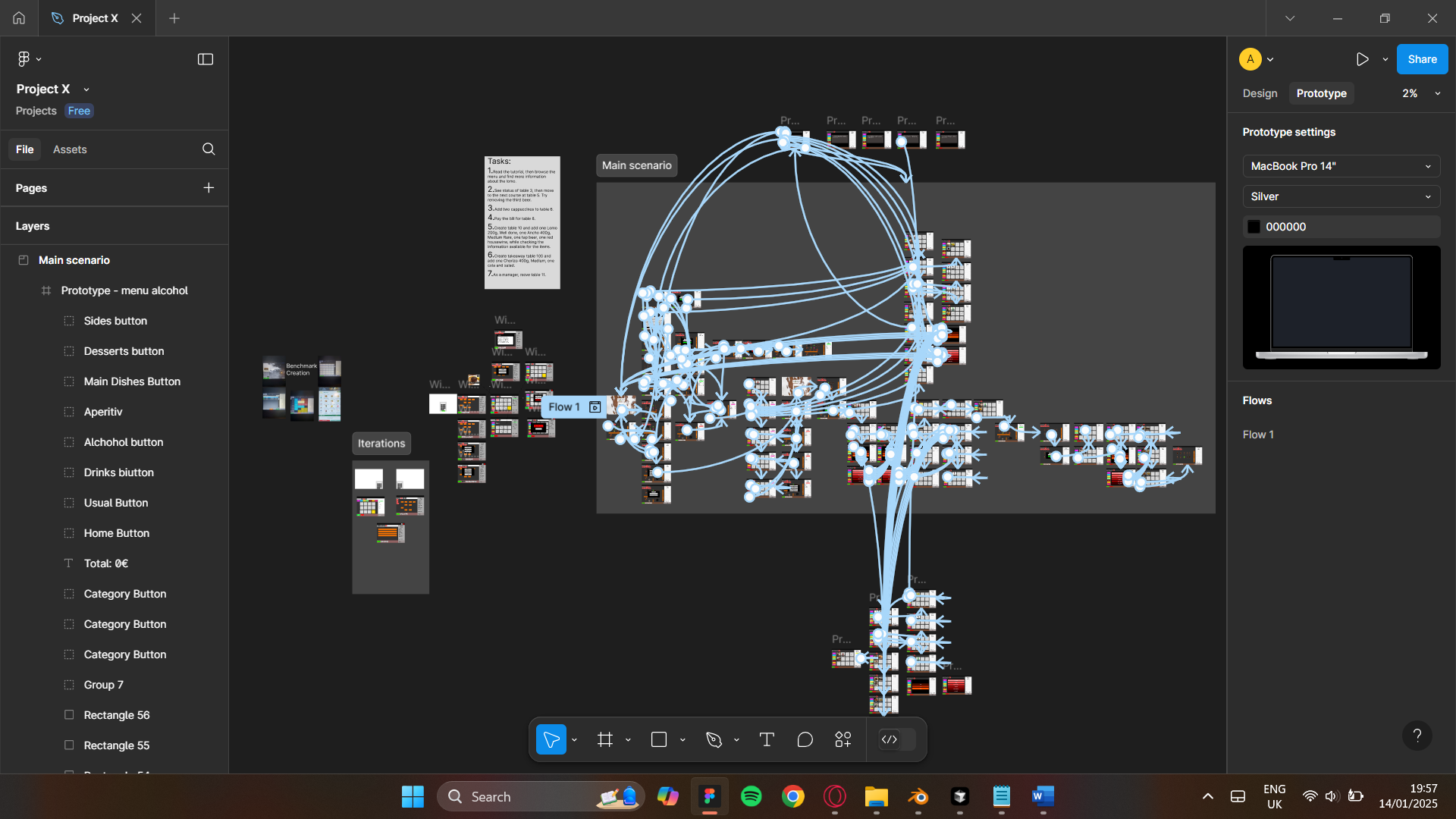
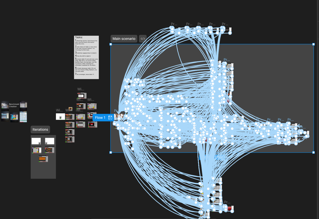
Following the completion of the empathize, define, and ideate stages, I proceeded to create a Figma prototype. This prototype comprises 82 screens, illustrating the interactive and visual aspects of the design concept. To follow the flow, the user is tasked with completing tasks in a logical order.
Test
Before the final stage involves conducting usability testing. The primary objective of this User Testing (UT) is to gather valuable insights into user behavior while placing orders through the app. This study is designed to comprehensively understand user types, their behaviors, and the specific needs and challenges they encounter when interacting with the prototype.
Summary Insight + Recommendation
Summary Insight + Recommendation
UT1:
Overall the design of the app is good, many improvements have been made regarding the colors and overall aspect of the page.
The tutorial was a good improvement, the functionality looks simplified and has more visual appeal. However, the tutorial is not that obvious to access.
“The tutorial touch is nice but can be highlighted better, maybe with an information button next to the user”
The buttons aren’t that appealing, just the colors are the good addition to them.
“The buttons could be better emphasized, this kind of looks like a trial version because of it.”
The draggable table interaction must be added as it’s a useful gimmick for the restaurant to have, as well as creating more iterations for navigation.
“Make the logical options of the item selection work”
Assess
The design of the app has seen many improvements regarding the colors and overall aspect of the page. The buttons are more accentuated and the information is displayable for all the available items. The tutorial was more accessible, and the buttons had a clearer look. The draggable system works and is a nice touch. The flow of the tasks works and the stakeholders had a good impression of the design, even recommending to send it to their development team.
"
Conclusion
The process of improving order management efficiency and user satisfaction in restaurants was driven by a user-centered approach. Interviews with staff helped uncover key pain points and informed the creation of a persona to better address their needs. Through task analysis, wireframing, and prototyping, a more effective design was developed, with user testing conducted twice to refine functionality and usability. This approach ensured that the final interactive UI design directly tackled existing challenges while aligning with the workflow and preferences of restaurant staff. Therefore, through following a methodical approach I uncovered key aspects the steps
Reflection
This project highlighted the importance of a user-centered approach, where interviewing staff and creating personas helped uncover key pain points and prioritize user needs. Each step, from task analysis to prototyping and usability testing, built on the last, ensuring the design evolved into a practical and visually appealing solution. User testing was especially valuable, revealing areas for improvement like tutorial accessibility and button design, which were refined in subsequent iterations. Balancing aesthetics with functionality proved crucial, as features like the draggable table interaction enhanced both usability and efficiency. Ultimately, the positive feedback from stakeholders confirmed that this iterative, user-focused process led to a design that effectively addresses real-world challenges.