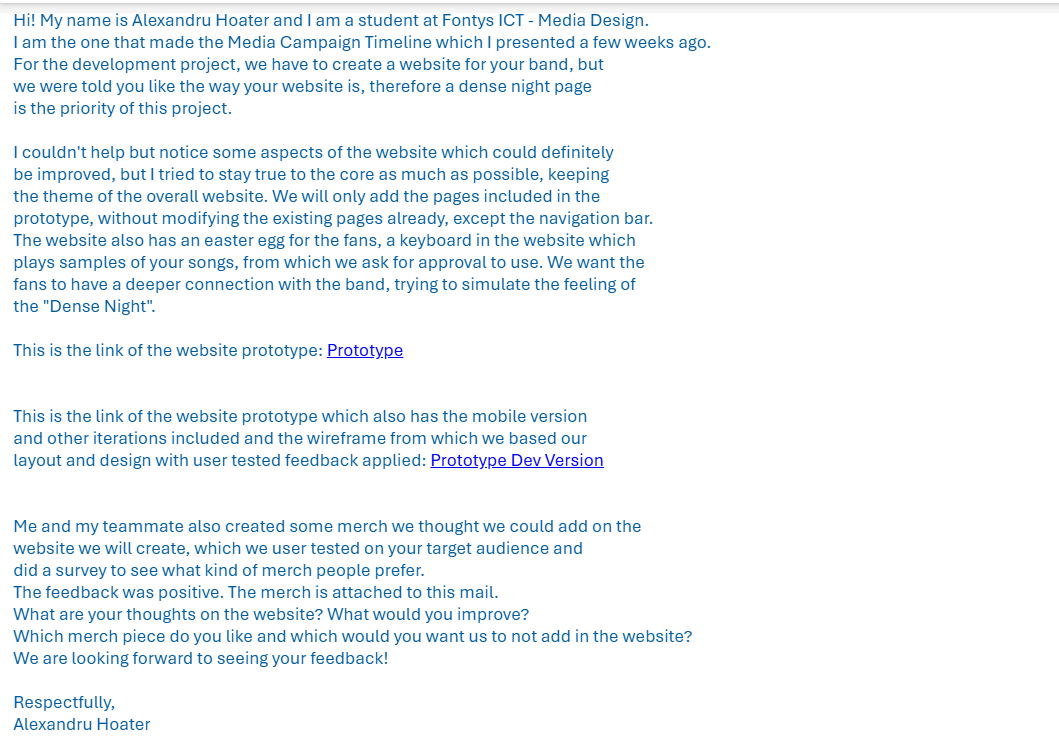
Development
Client: Nasmak PM
Goal:
Create a Dense Night page for our client and improve the existing website
Research Question
Research Question: How can we create a fun, user-friendly event webpage that improves engagement, makes navigation easy, and stays true to the client’s brand and vision?
Reason
This project started by splitting the teams of 6 and creating teams of 2, after which we had to make a project plan and deliver a dedicated website for the Dense Night event, acting as a funnel for the buzz generated by the concert. Have a lot of moving elements on the website and use the style and inspiration we got from project 2, creating an easter egg as well.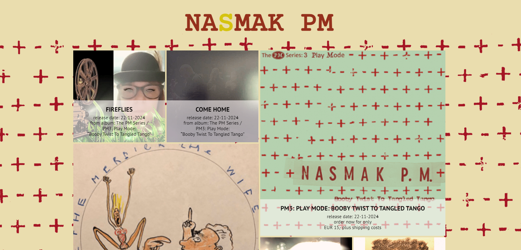
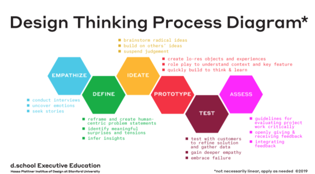
The Process
CMD Methods: Benchmark Creation, Interview ,Prototyping, Usability Testing
Methodology
Qualitative(Benchmark Creation):
Scout for products that are somehow related to your design goal. These could be products that solve the same problem or adopt a similar solution strategy.Qualitative (Interview):
This method is employed to gather insights into user behavior, needs, challenges, and expectations while utilizing the website.Qualitative (Usability testing):
This method was used to gather the amount of problems and technical difficulties the user is facing when navigating.Empathize
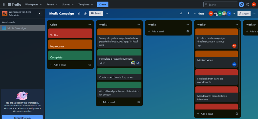
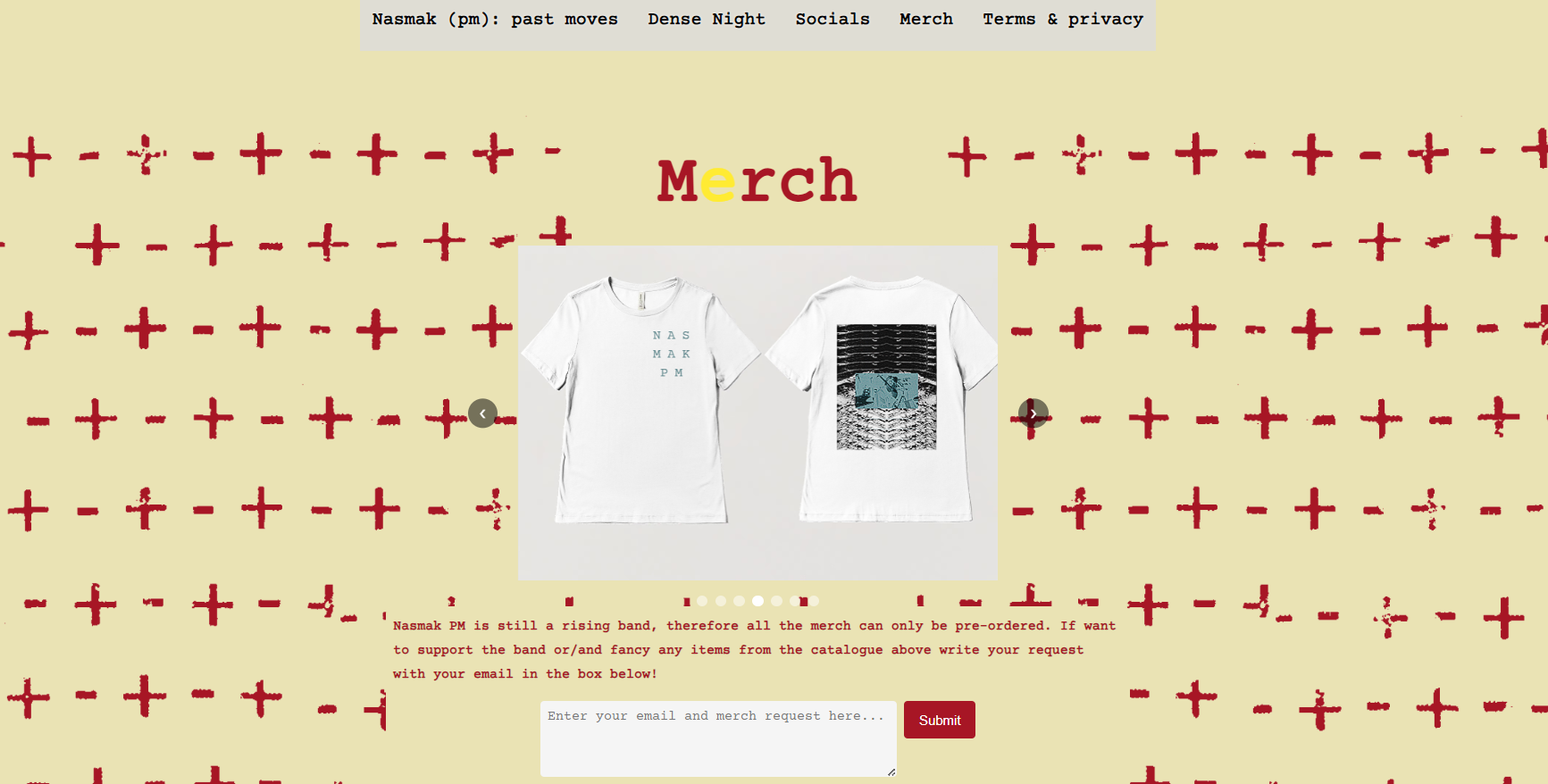
Our new team created a project plan and Trello board to have a better workflow and be more structured on our approach. We used the research on the target audience from the Media Campaign project to create merch for their website as they had just a submission form on the website.
Define
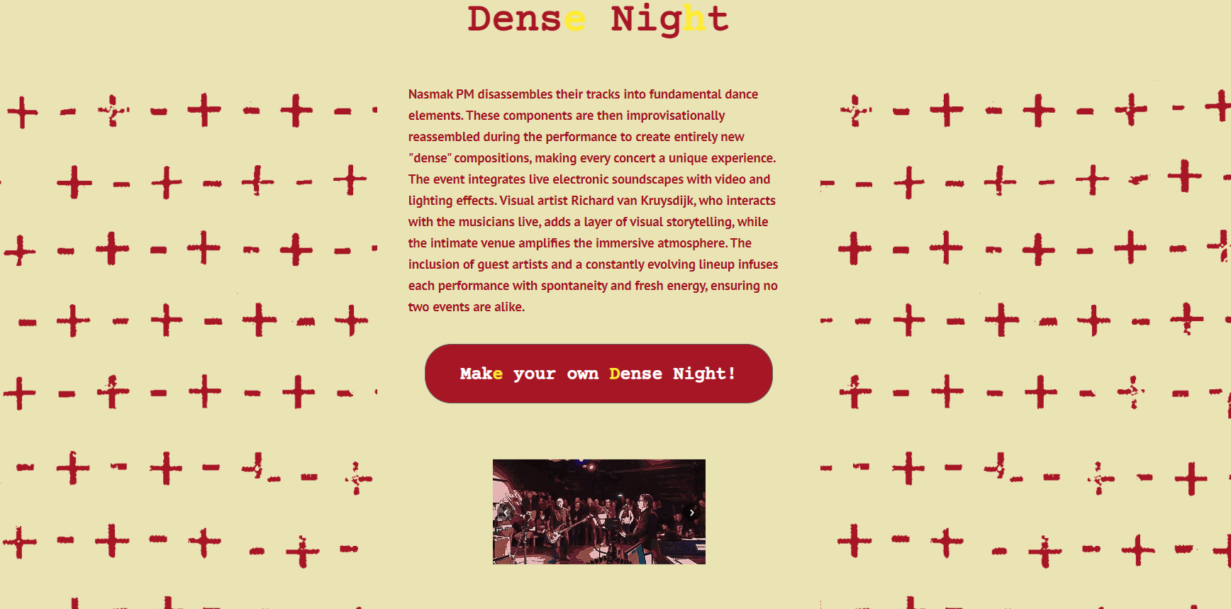
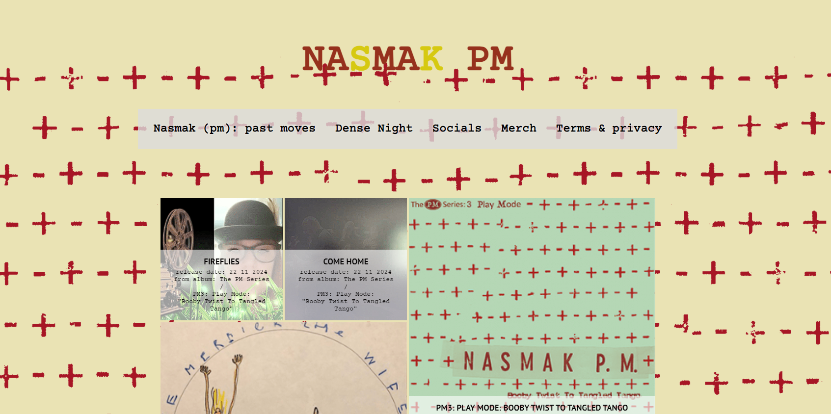
In the define stage we went on to analyze their website and see what could be improved, added or removed. Featues like the navigation bar being at the bottom of the page, a lot of layout inconsistencies and no merch menu were obvious to improve.But Nasmak was only interested in a website for their concept of Dense night, but we went a step further and integrated it into a modified version of their website, with an easter egg for the fans and information about dense night, as well as improvements on existing features.
Ideation
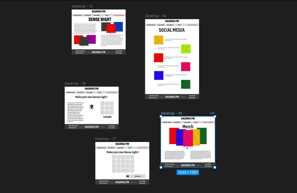
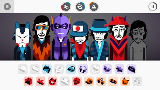
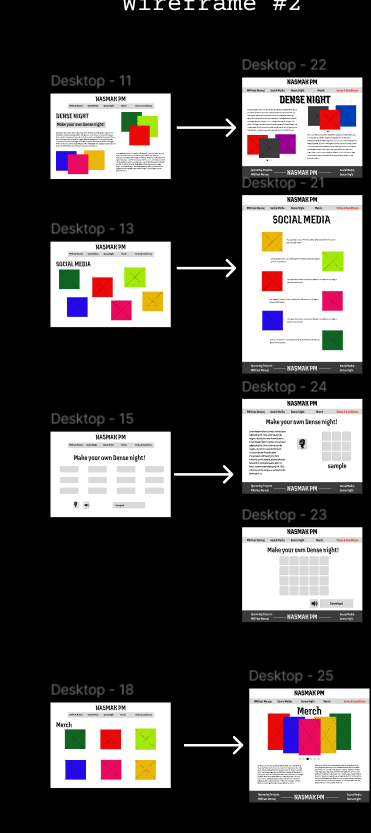
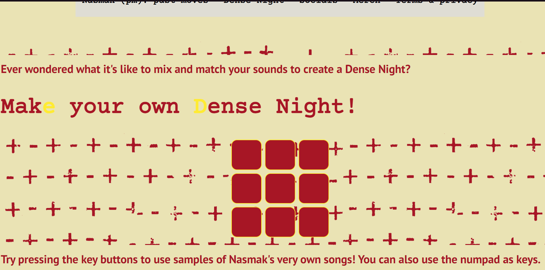
I went on to create a wireframe to help me layout the base of the prototype, from which I was more creative than sticking to the website structure they had, therefore after an interview I restructured the wireframe. I thought of adding a gimmick of a soundboard from the Incredibox game. After completing the wireframe, I moved on to the next step, where I created a high-fidelity design, which was helped me create a clear vision of the website.
Prototype
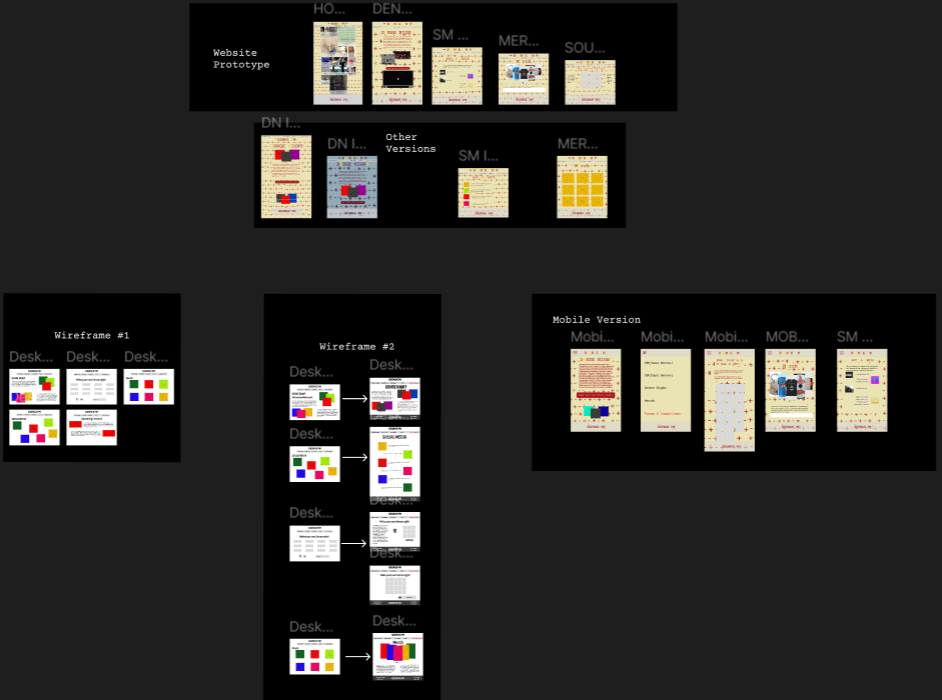
Following the completion of the empathize, define, and ideate stages, I proceeded to create a Figma high-fidelity prototype. This prototype comprises 6 screens followed by a mobile version our team created and iterations of the screens. Thus, illustrating the interactive and visual aspects of the design concept. I focused on keeping the designs as true to the client’s vision as possible while adding my creative input. These iterations were then sent to the client for feedback, as well as reviewed by my design teacher.
Test
Before finishing the final phase of the project we did usability testing. The primary objective of this User Testing (UT) is to gather valuable insights into user behaviour while navigating the website. This study is designed to comprehensively understand user types, their behaviours, and the specific needs and challenges they encounter when interacting with the website.
I first did a summative user test in which the users were the target audience having as task to navigate the website in the scenario of them wanting to find out more about the band.
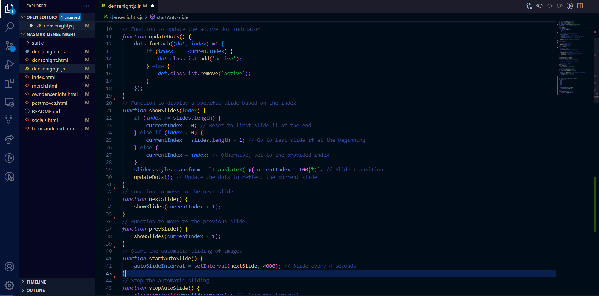
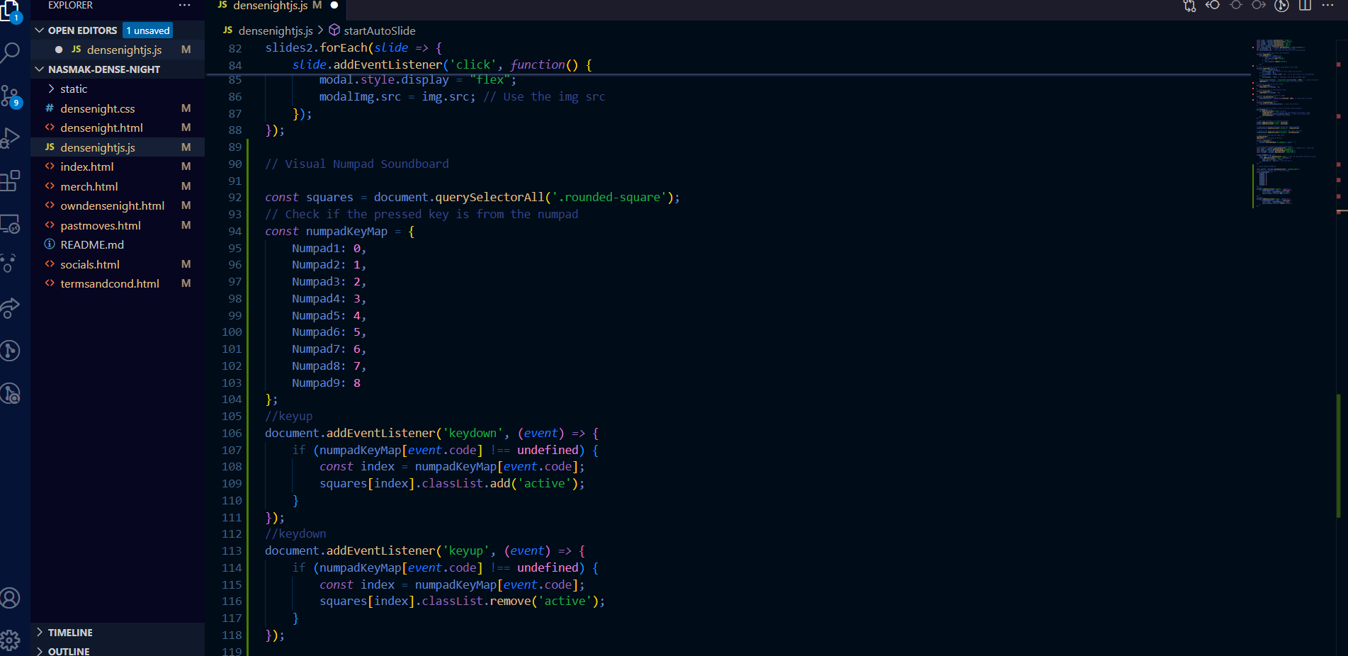
After which, the team went on to create the website using HTML, CSS and JavaScript, by keeping track of our work using Trello and Git. The hardest part about it was creating the slicers and keyboard feature, as they both required extensive JavaScript which I integrated into the code. Also working out with WordPress to HTML for the title.
We then user tested through usability testing and a heuristic evaluation. I applied the feedback I received from my assessors and UX teacher Anke, to then create a more structured and formative usability test. Traditionally, the heuristic evaluation is done by a usability expert, but to fully grasp the target audience’s perspective of the website I combined the CMD Methods, as there are not many complex tasks to perform in the website.
Summary Insight + Recommendation
UT1: Summative user test compared with the website side-by-side:
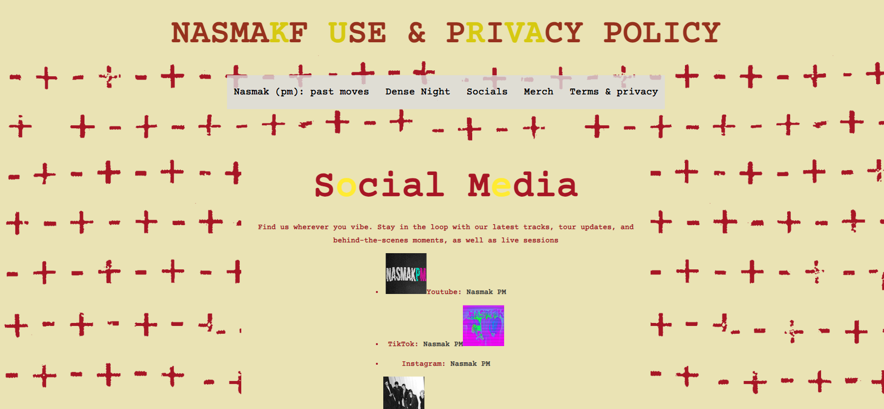
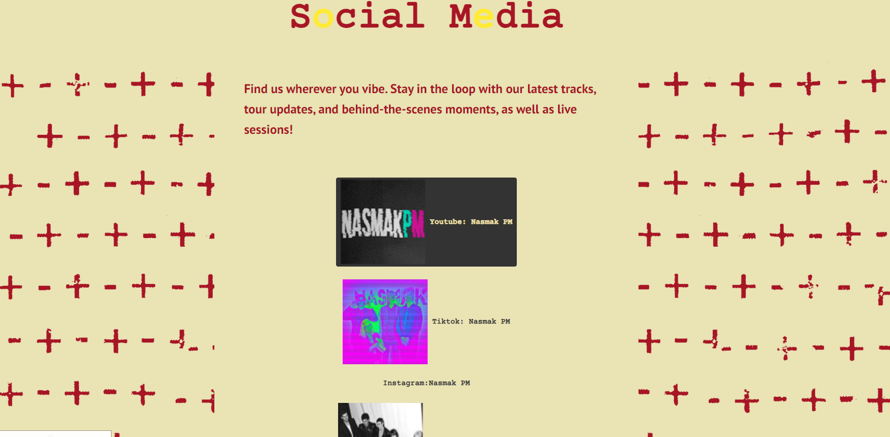
The social media page being the first thing to point out as needing improvements in layout is a clear sign I must change it and align it differently. The navigation is clear and comprehensive.
"The social media page can be better aligned, like more compact, but I like the design overall. "
"Yes, looks pretty clear compared to the previous one and I don't have trouble finding what I want"
UT2: Positive findings:
-The website appeals to most of the heuristics:1,2,3,4,6
-It fits the theme of Nasmak for the target audience
-Not many problems reported by the users
Negative findings
-The modal images do not work, they need to be fixed as they appear beneath the screen and cannot be reverted. :3- major problem
Heuristic violation:5,8,9
- “The numpad doesn’t make the keyboard light up to know which key are you pressing, and the keys having no names doesn’t help that much either”
Heuristic violation:7
Assess
Results after the first feedback:
The social media page was made more compact, and the coding of the website began. While keeping track of tasks, our team’s greatest struggle was deciphering the existing code of the website, and to what extent can it be usable, as it was made in wordpress. I added also sliders instead of having the pictures spread out.
Results after the second user test:
UT2:
After concluding the test I fixed the website’s modals and made it so the numpad when pressed, triggers the key buttons. I also created a bigger layout for the social media section.
Presentation
The client was very pleased with the materials we sent him in the mail, however he didn’t have enough time to show it to the full team and give us feedback, therefore during the presentation the client told us that he was very pleased with the website and its prototype. We chose well in incorporating the project into their website as well as create a soundboard gimmick for them.
Conclusion
The Dense Night website project successfully combined creativity and functionality to meet the client’s vision while addressing user needs. Through a structured approach that included empathizing with the target audience, defining pain points, ideating solutions, prototyping, and user testing, we ensured the design was engaging and effective. Key improvements, such as a more compact social media page, fixed modals, and an interactive numpad, addressed user feedback and heuristic violations. More development feedback should have been given earlier, as I could have improved the project even more and more efficiently. The client appreciated the final website, including its integration into the existing platform, and the playful soundboard gimmick. Overall, the project highlights the importance of user tested design and collaboration in delivering a user-focused digital experience.
Reflection
This project taught me the importance of balancing creativity with client requirements and user needs. I learned how vital it is to approach existing codebases—like the WordPress site—with patience and adaptability, as understanding and working within these constraints can be challenging but rewarding. The iterative design process reinforced the value of user testing, as feedback directly guided improvements, such as fixing modals and refining the social media layout. Additionally, I realized how small interactive elements, like the soundboard and numpad functionality, can enhance user engagement when executed thoughtfully. Overall, this experience emphasized the importance of communication, flexibility, and staying user-focused throughout the development process.