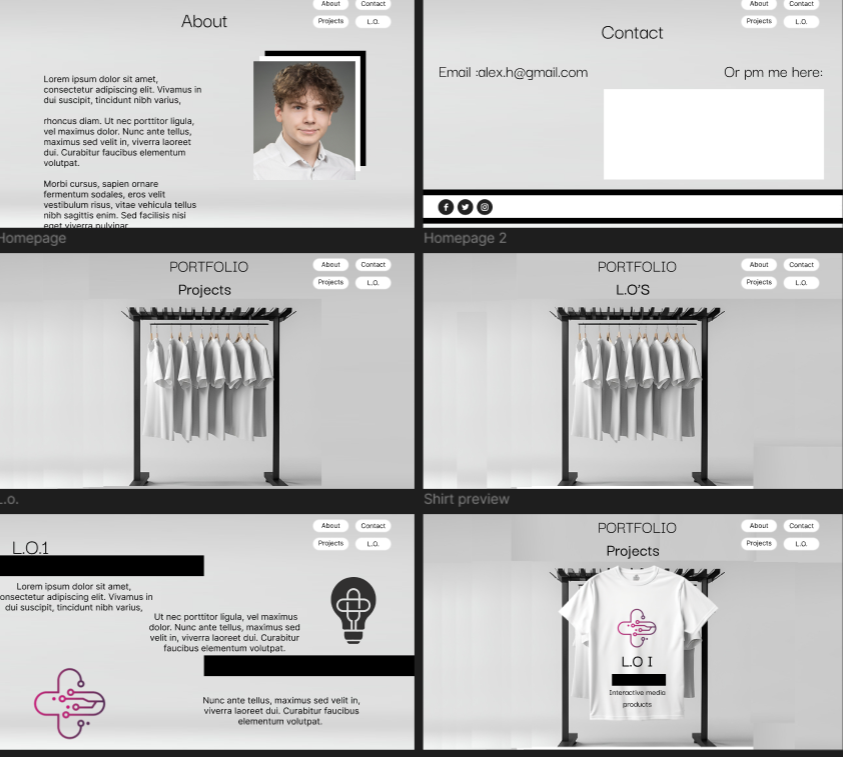
L.O.1
First Example
Goal:
Create a unique website design and an interactive prototype using Figma.
Why: What problems are the users facing when interacting with the portfolio?
How: Cmd Methodology: Usability Testing, Interview
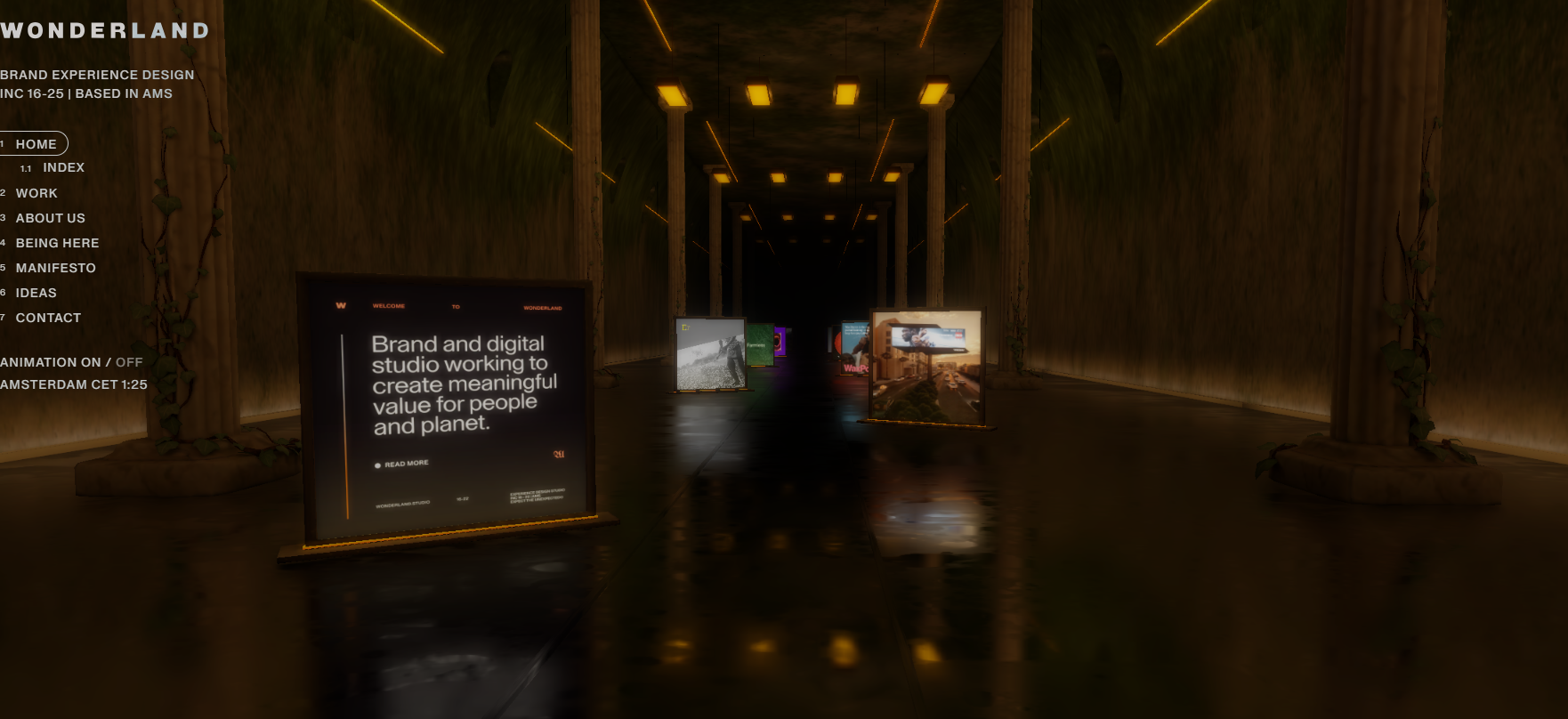
The idea came from the wonderland design, as it was a good example of a website with a lot of 3d animations, and I wanted to create a similar website.
I have to detect the problems users have with my design and try to correct these before the deadline. It is impossible to get the design right in one go, no matter how much experience someone has. So, I asked a few participants to test a prototype of my product/solution. Users are asked to think aloud so you can grasp what the user is thinking. In a formative user test the goal is to detect as many problems as possible users are encountering using the site. In this summative user test user behaviour is tested against pre-set goals.
At first, I tried recreating a summative usability test, which turned out to be an interview of two university students about the problems they are facing in the portfolio. However, my UX teacher and assessors have provided me feedback on restructuring it and creating a better, complete version of it actually being a usability test, alongside interview questions.
Therefore, I remade the test, this time using a planner and a certain set of tasks which I logged the progress of in the document below.
Feedback on prototype
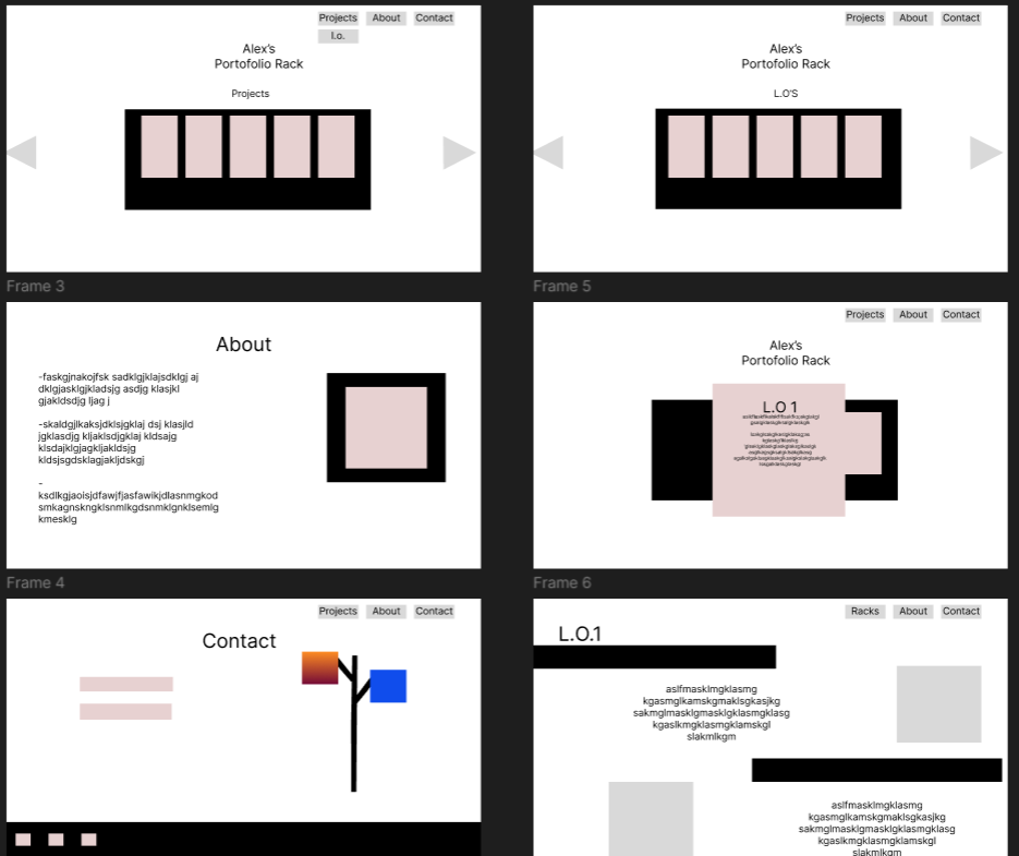
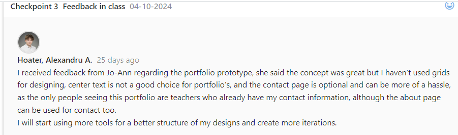
• Jo-Anne liked the overall concept and emphasized the need for grid usage to improve the design's structure.
• After removing the contact page, I had more time and space to focus on the main sections, leading to a better-organized and visually appealing layout.
• I must make the image designs in the prototype more clear, in the wireframe I should create them the usual way with a cross inside. Making the squares colorful doesn't help with clarity.
Feedback on User testing
More open research questions
• After removing the contact page, I had more time and space to focus on the main sections, leading to a better-organized and visually appealing layout.
• Create a scenario for the user to follow, then ask questions about the experience and write down the interactions the use has while performing the actions.
Key Insights:
• It takes too long to scroll back up, a button that does that must be added
• Resolution is bigger than expected, some sections of the website are not fully visible
• Location issues throughout the page, some due to responsiveness
• Make sure the links work without needing permission to access files
From this usability test and new interview questions, I tracked the key insights and made changes to the portfolio based on them. The trickiest part was recreating the navigation, to make it fit with the switching colors theme.
Conclusion
The website clearly has more problems than anticipated, there are still some responsivity issues I couldn’t observe because my zoom was preset to a certain %, which I wasn’t aware of, as well as the links inaccessibility. I will go on and implement these changes to the prototype, toward completing it and trying to finish with the 3d animation.

Reflection
With this user testing I realised that testing with someone which hasn’t worked on developing the website gives you further insight, as well as testing on different devices and resolutions allowed me to make the reparations needed to improve my website faster than expected.
I learned how grids can enhance organization and flow, and how simplifying content can improve the overall design. By balancing my creative vision with professional practices, I created a portfolio that effectively represents me and meets functional needs. Additionally, this experience helped me grow more comfortable using Figma and sharpen my design skills.
L.O.1
Second Example
Goal:
Create a usability test combined with a heuristic evaluation for the NASMAK website
Why: What problems are the users facing when interacting with the website?
How: CMD Methodology: Usability testing, Heuristic Evaluation.
Detect problems users have with my design and correct these before the product goes live. It is impossible to get the design right in one go, no matter how much experience someone has. I asked a few participants to test a prototype of my product.
Users are asked to think aloud so I can grasp what the user is thinking. In a formative user test the goal is to detect as many problems as possible users are encountering using the site.
Before starting this official user test, I tried to emulate a summative user test through interview questions from the users, however through feedback from the teachers I restructured it, as it can be seen in the first example.
Users are given detailed instructions or tasks, a set of usability guidelines, and a reporting format. The users analyse the website for violations of the guidelines and suggest improvements to the website
Traditionally, a usability expert is in charge of the evaluation, but on this user test I combined the two CMD methods to get clearer responses.
Positive findings
-The website appeals to most of the heuristics:1,2,3,4,6
-It fits the theme of Nasmak for the target audience
-Not many problems reported by the users
Negative findings
-The modal images do not work, they need to be fixed as they appear beneath the screen and cannot be reverted. :3- major problem
Heuristic violation:5,8,9
-Bigger pictures which would have been added by the modals do not work: 2- minor problem
Heuristic Violation:10,8
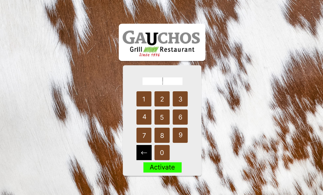
- “The numpad doesn’t make the keyboard light up to know which key are you pressing, and the keys having no names doesn’t help that much either”: complex problem
Heuristic violation:7
Conclusion
After concluding this test I will further fix the website’s modals and address the numpad situation, as well as create a bigger layout for the social media.
Reflection
Looking back on this user testing, the heuristic evaluation helped me realize the user’s wishes better, visually increasing the aspect of the keyboard with the numpad touch, as well as the usability testing, helping me to discover functionality problems of the website. Usability testing and heuristic evaluation show how real users interact with a website and where they struggle.
Watching users helped me find the problems and see what worked well. Heuristic evaluation checked if the design followed good usability rules. Both methods taught me what needs fixing to make the website easier and better to use.
L.O.1
Third Example
Goal:
Create a usability test which will aid in the design of project x
Why: What are the improvements my design adds to the currently existing app?
How: CMD Methodology: Cmd Methodology: Usability testing, Interview
Detect problems users have with my design and correct these before the prototype is seen by the client. It is impossible to get the design right in one go, no matter how much experience someone has. I asked a few participants to test a prototype of my app design. Users are asked to think aloud so I can grasp what the user is thinking. In this summative user test user behaviour is tested against pre-set goals.
It is hard to design for users you do not fully understand. Interviews allow you to understand users better by gathering their opinions, behaviours, goals, attitudes and experiences. You start by inviting participants, make them feel comfortable and ask questions about your topic of interest, in this example the experience they’ve had with the prototype.
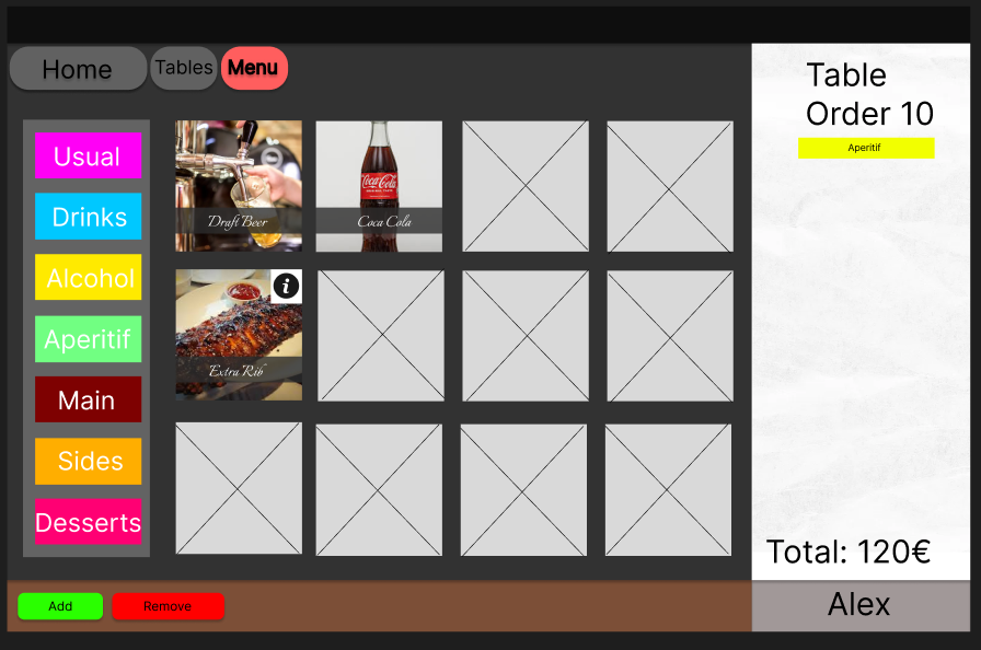
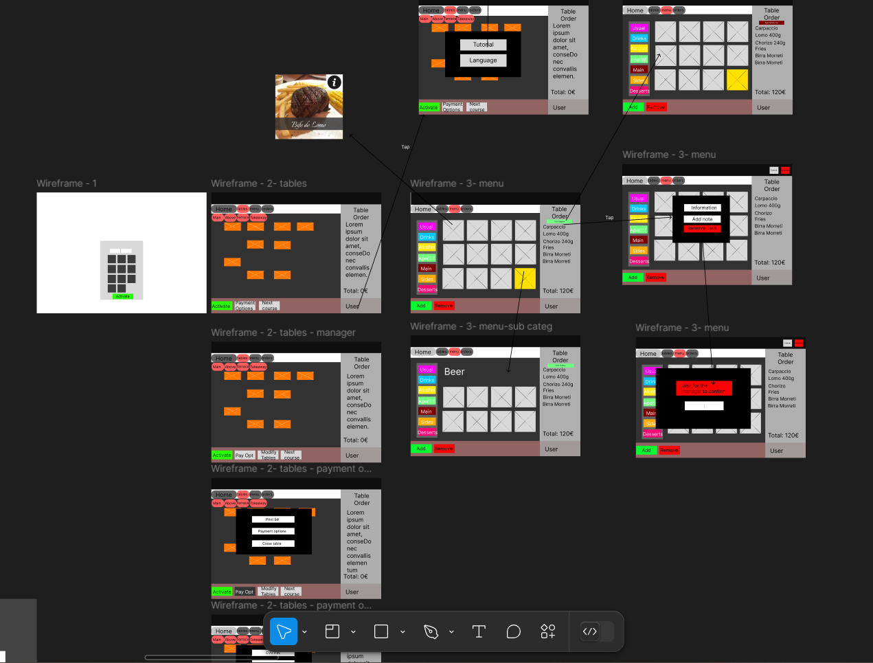
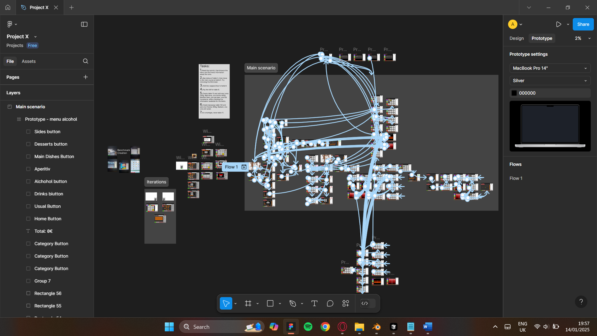
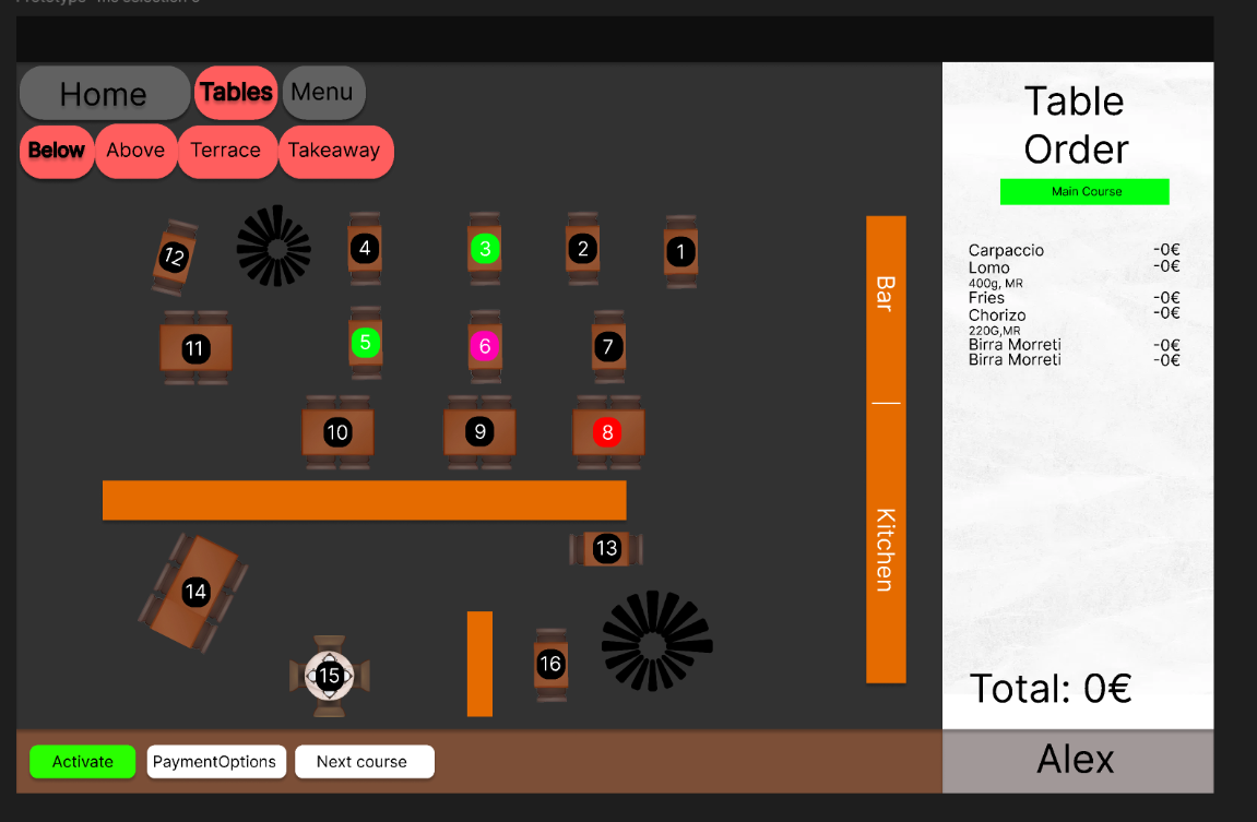
I created a prototype of the restaurant management app in which I had two users attended the test, waiters, each had the same tasks, were asked to give insight during the process and asked interview questions afterwards.
On the second user test, this time two managers, they were asked to do two additional tasks and changes to the initial tasks, as well as two other interview questions.
UT1:
Overall, the design of the app is good, many improvements have been made regarding the colors and overall aspect of the page. The tutorial was a good improvement, the functionality looks simplified and has more visual appeal.
However, the tutorial is not that obvious to access, first time users being the ones to use it the most, so not knowing the app beforehand does not help with this design. Creating a high-fidelity prototype means at least the flow of the scenario must be flexible in a complex possibility prototype.
The buttons aren’t that appealing, just the colors are the good addition to them. The draggable table interaction must be added as it’s a useful gimmick for the restaurant to have.
“The tutorial is not so intuitive to access, but it kinda makes sense and after the 5th time working people will stop using it”
“The tutorial touch is nice but can be highlighted better, maybe with an information button next to the user”
”Make the logical options of the item selection work”
“The buttons could be better emphasized, this kind of looks like a trial version because of it.”
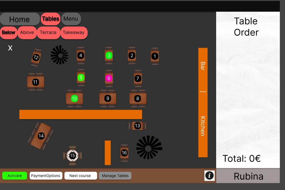
UT2:
The design of the app is nice, improvements have been made regarding the buttons and overall aspect of the page. The tutorial was a good improvement, the functionality is more user friendly and has more visual appeal,
now being able to add a note to the order, and see more information about each product, as well as the implementation of the takewaway system. The draggable table is nice to see in practice but could have been more in-depth improved using other software than figma.
The only tweaks left are adding more order visibility interactions with the menu to the prototype.
Conclusion
UT1: The app’s design has improved a lot, especially with better colors and a cleaner overall look. The tutorial is a great addition that makes things easier to use, but it’s not very obvious for first-time users to find. A good prototype needs to be flexible enough to handle different scenarios smoothly. Making the buttons more appealing and adding a draggable table feature would make the app even more practical and user-friendly, as well as adding more functionaity like item deleting in the scenario.
UT2: The updates to the app’s design have really made a difference, with better buttons and more functionality. The improved tutorial and smooth task flow were a nicely done addition, showing just how much the app has improved. Stakeholders were impressed and even recommended moving forward with development, which is a great sign. Overall, these changes have set the app up for success and made it much more practical and enjoyable to use.

Reflection
With this user testing I realised that testing with the stakeholders which fit the target audience of the product creates a much deeper understanding of the client’s wishes and bringing the vision to life. Delivering a fully finished product was not needed in this project due to the stakeholder’s wishes, however the whole interactive part was task based due to software complications and the multitude of possibilities and combinations this app has. I will dive into new software to build even more interesting and interactive prototypes for my future clients.